9 unique website color schemes from popular brands
Big brands are experts at wielding their well-known color schemes to create the unexpected, here’s what you can learn from them.
When you visit the websites of famous brands like Facebook, The Home Depot, or McDonald's, the color schemes you see aren't a surprise. But creating a great brand color scheme is just the first step — savvy companies know how to strategically apply their color schemes as well.
Let’s explore the color palettes of well known brands and discuss how different color combinationsand even color psychology can influence how consumers perceive brands.
9 brand color schemes and lessons you can learn from them
McDonald's
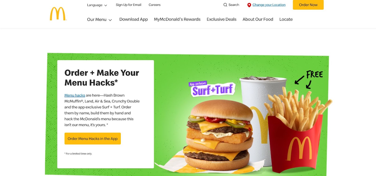

Primary color scheme
McDonald’s Yellow #ffbc0d
Conveys warmth, optimism, and happiness.
Used in buttons, the logo, and alerts like the cookie disclaimer.
McDonald’s Red #d90007
Conveys anticipation, excitement, and playfulness.
Used in the menu selection indicator, graphics, and the pins for finding the closest location.
The classic McDonald's combination of red and yellow is the same color scheme as many other fast-food companies. So much so that it has spawned its own folk theory called the ketchup and mustard theory, which states that red and yellow are so popular among fast-food restaurants because:
- Yellow communicates quickness and is visible at long distances (i.e., from the road).
- Red can have physiological effects like stimulating your appetite and quickening your pulse.
In 2019, McDonald's introduced a new visual identity that upended this classic color combo by swapping the hierarchy of red and yellow. Instead of the yellow-on-red design we all grew up with, McDonald's made a "sunshine yellow" their main color, and demoted red to a supporting role.
With this new visual identity, McDonald's hopes that:
- Yellow communicates warmth, optimism, and happiness
- Red conveys anticipation and excitement
- Supporting colors, like teal and pink, tie a sense of playfulness to their associated products
The McDonald's website uses yellow wherever they want you to take action, like the "Order Now" button. Red appears sparingly, indicating a sense of place as a menu selection indicator or a pin for finding the closest location.
Takeaway: If you have a tricky color in your brand scheme, like an aggressive red, use it sparingly to communicate something specific, like a sense of place or a desire to take action.
Apple

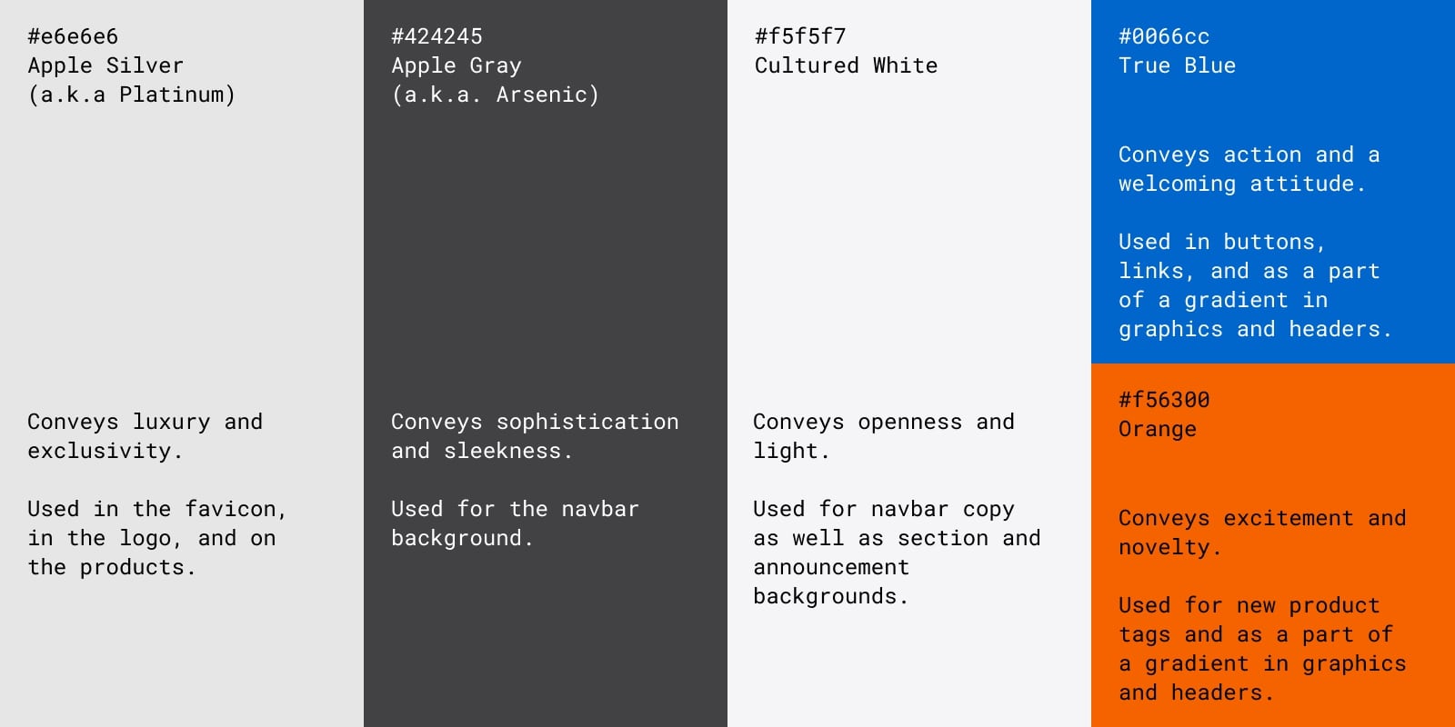
Primary color scheme
Apple Silver (a.k.a. Platinum) #e6e6e6
Conveys luxury and exclusivity.
Used in navbar copy, the favicon, in the logo, and on the products.
Apple Gray (a.k.a. Arsenic) #424245
Conveys sophistication and sleekness.
Used for the navbar background.
Cultured White #f5f5f7
Conveys openness and light.
Used for navbar copy as well as section and announcement backgrounds.
Accent color scheme
True Blue #0066cc
Conveys action and a welcoming attitude.
Used in buttons, links, and as a part of a gradient in graphics and headers.
Orange #f56300
Conveys excitement and novelty.
Used for new product tags and as a part of a gradient in graphics and headers.
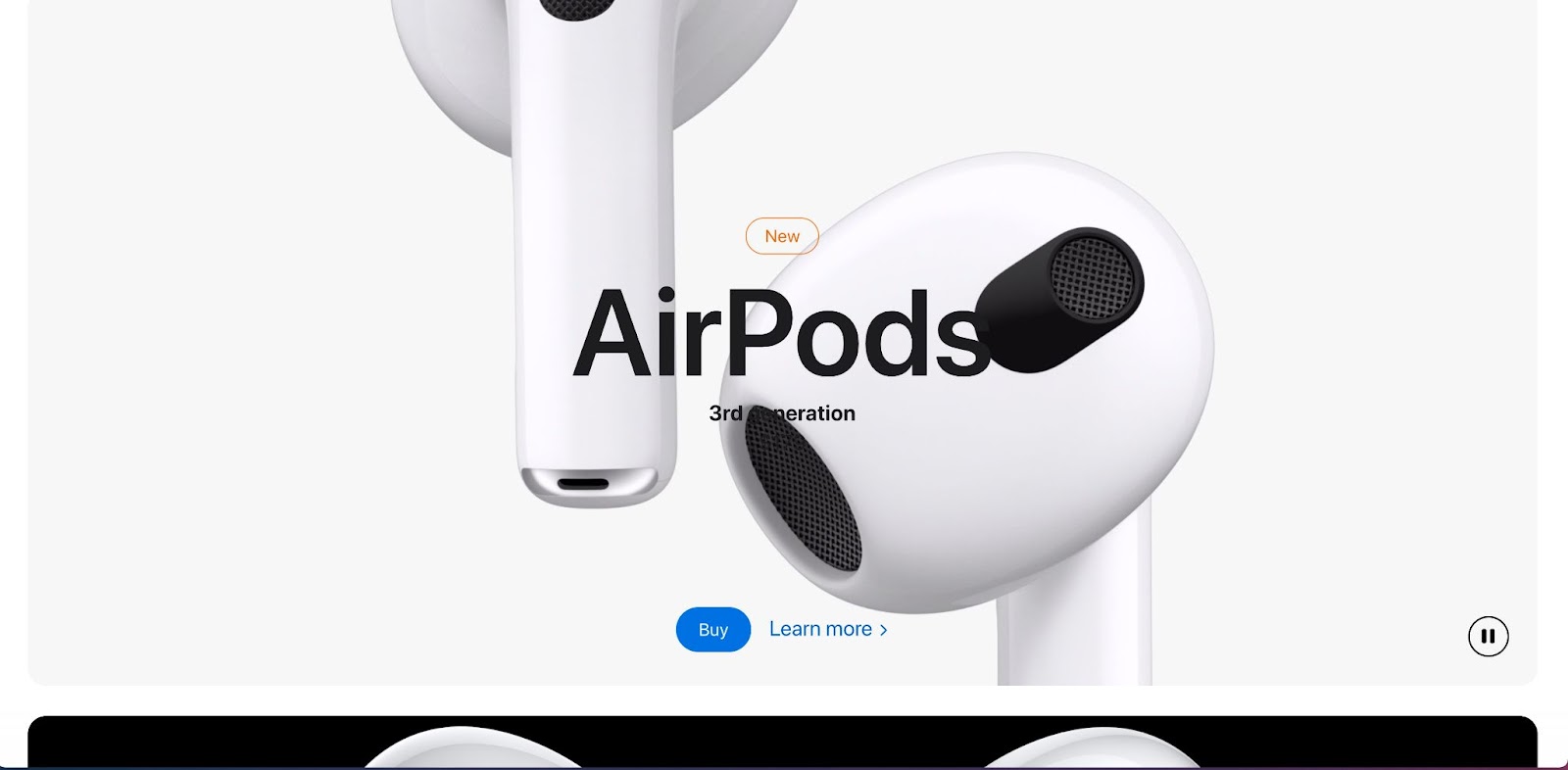
Apple has relied on minimalism to communicate a sense of luxury and elegance since its inception. In one famous 1978 ad introducing the Apple II computer, they came right out and said, "Simplicity is the ultimate sophistication."
Apple doesn't need extra flourishes to sell their work. The fundamentals, executed simply and expertly, are enough. Apple's minimalism also serves the more practical function of putting their products front and center. The core neutral color scheme makes the hero images stand out.
In the screenshot above of Apple's homepage, a glossy closeup of the new iPhone 13 Pro grabs your attention. The simple, expertly crafted lines of the phone and its camera are the first thing you see with craftsmanship as the focus. The background colors on Apple’s website serve as a framing device for the products themselves.
Takeaway: If you're working with a neutral brand color scheme, use it to frame the quality of your product or service.